UX Challenge
How to build an app in 4 weeks
Villa Park Landscape was a successful design and maintenance company that was facing the challenge of consistency at scale. With the majority of their employees working outdoors and onsite at different properties, they were all issued phones but no standard process to communicate job progress or bid requests. Therefore, the data coming into the home office was a jumble of emails, texts, handwritten notes, and photos. This resulted in more time spent by the office staff interpreting and organizing reports before they were ready to send off to clients, increasing bid turnaround time and reducing sales. The Villa Park Landscape management team wanted a portable documentation solution that could organize data intake and effectively output files to the home office for processing. This “Punchlist” app would standardize the project reporting process and drive efficiency and revenue for the business as a whole.
High-Level Requirements
• iOS native app built for an iPhone SE
• The ability to capture photos and take notes of issues on the job site
• Editable PDF document sent to the home office directly from the app
Project Timeline
1 month for Research, Discovery, and Design
1 month for Development and QA
My Role and Responsibilities
Lead UX Designer while partnering with an Associate Designer and iOS Lead Web Developer.
Final Deliverables
• Over 50 unique screens
• A complete user flow with annotations
• Basic Design System
• Custom PDF template
Success Metrics
• 80% adoption rate
• 150% increase in workflow efficiency
Process
Research and Discovery
To fully understand the problem space, my design partner and I led a design brief workshop where we guided the client through a series of questions focused on understanding project and business objectives, the users and their needs, the product environment, as well as any risks and challenges we may encounter.
We took the information from the design brief and distilled it into an affinity diagram to highlight key information that would help shape the project direction.
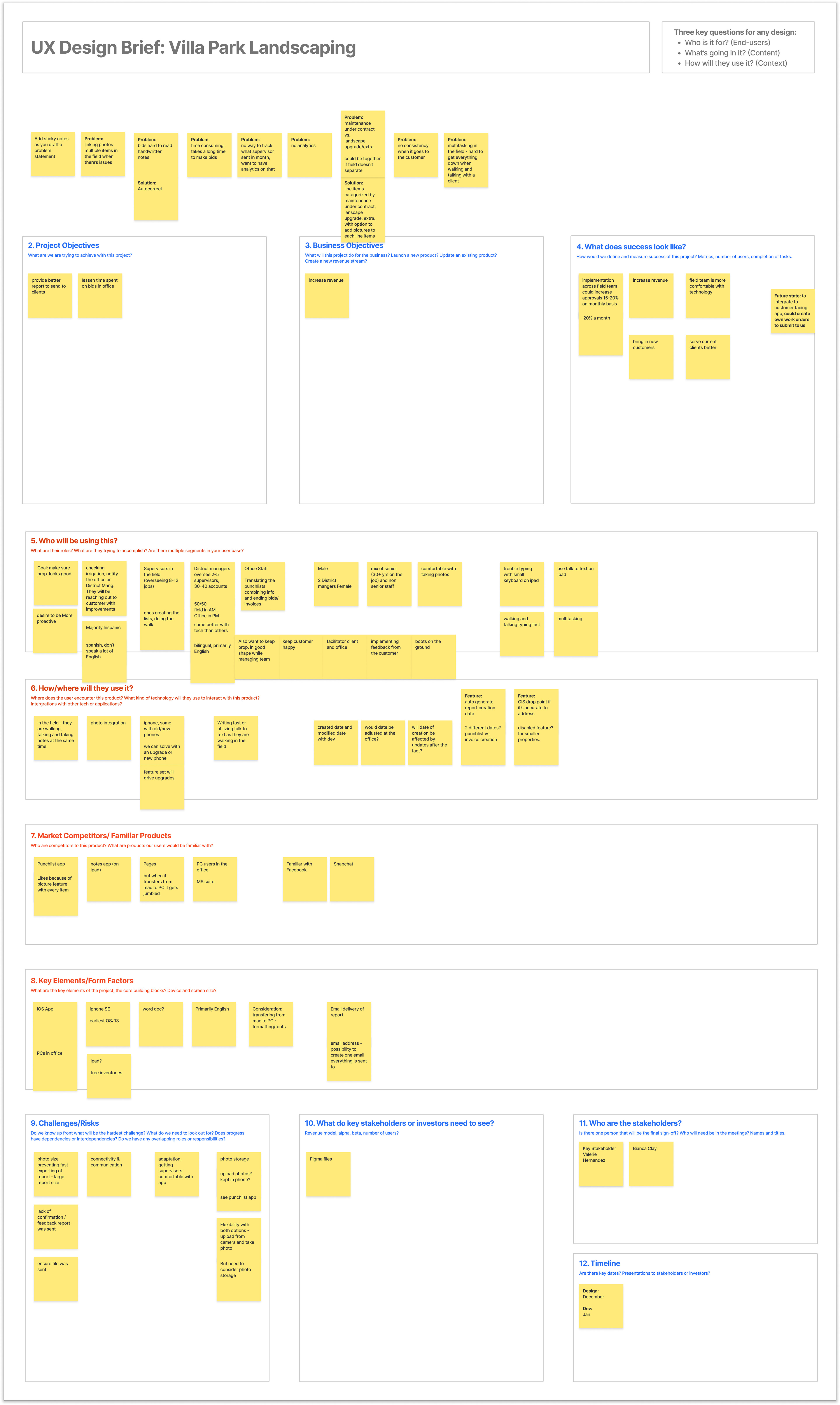
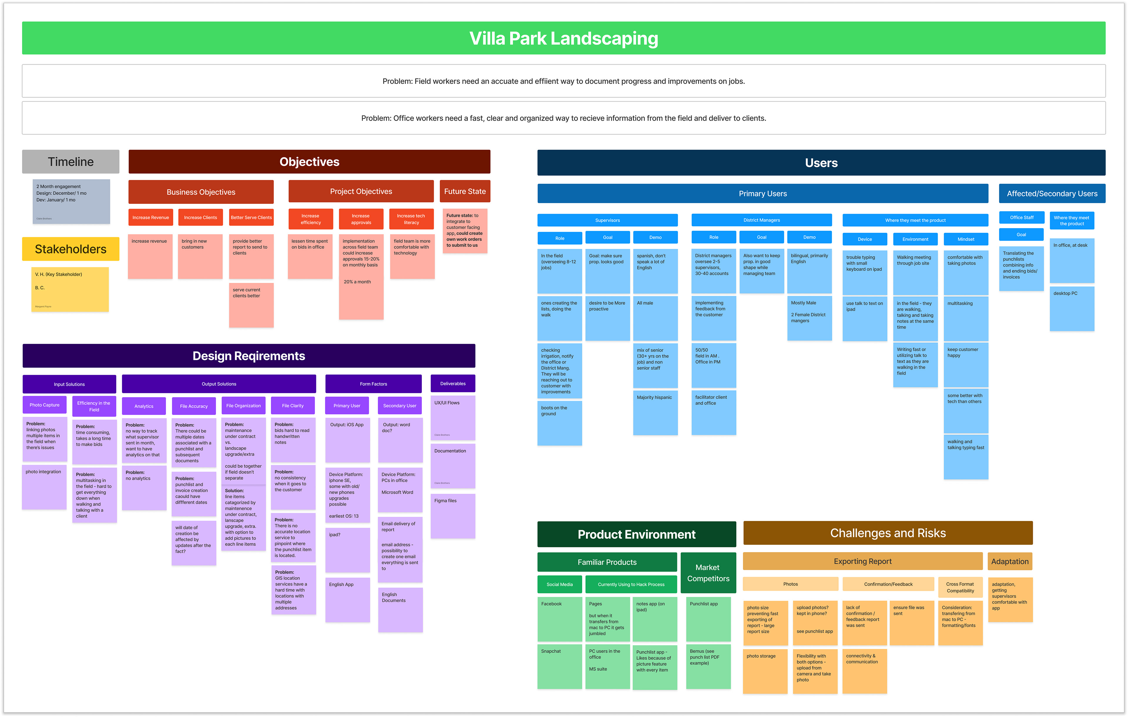
Design brief and Affinity diagram
Business Objectives
• Increase revenue
• Increase the number of clients
• Better serve clients
Project Objectives
• Increase Efficiency
• Increase project approvals 15-20% per month
• Increase tech literacy throughout the company
With initial Discovery underway, we realized that it was still unclear how a potential user of this app currently did their job with the current tools at their disposal. What was a typical workday like? What were the workarounds? What were the friction points?
To answer these questions, we set up a “Day in the Life” user journey exercise with a key stakeholder and future user. We asked her to take us through a typical visit to a client's property from the moment she got in her car to the instant she sent her report to the Home Office. We wanted every detail; what she was thinking, how she was feeling, what frustrated her, what was easy, etc. We uncovered a wealth of user wants and needs, most of which went far beyond the Stakeholders’ initial asks. This was the key step that gave shape to what this app really needed to be. The stakeholders weren’t even aware of it until someone asked the right questions and really listened to the answers. This went a long way in establishing trust.
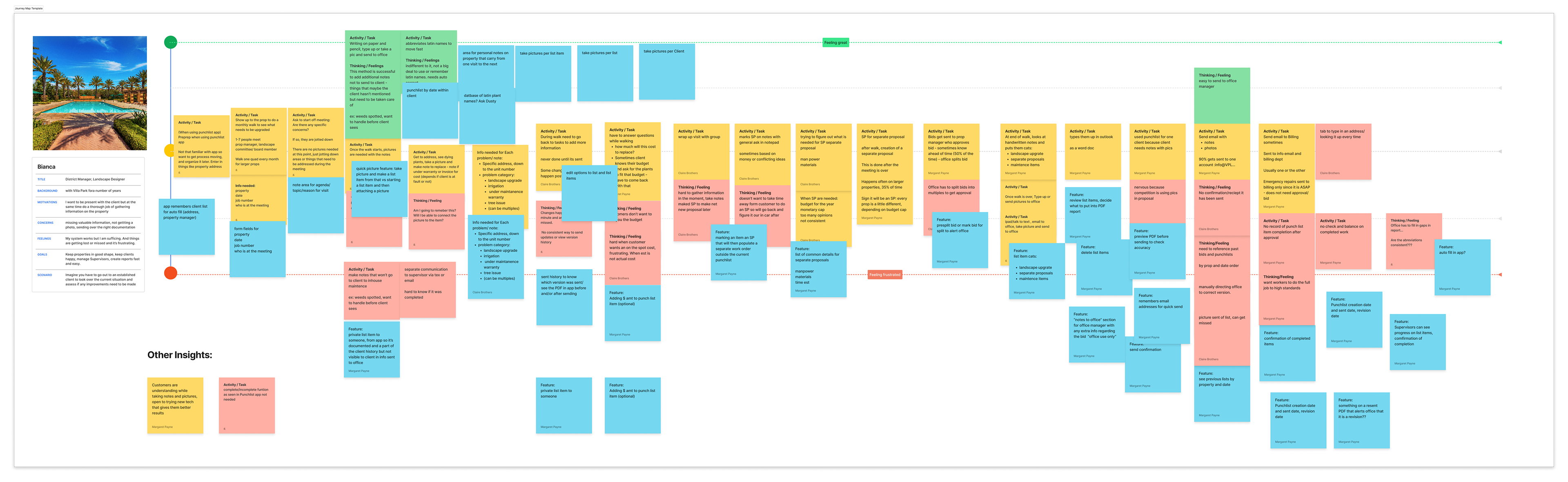
User journey exercise
By combining the Design Brief and User Journey output we now had a long list of features that needed prioritizing. With only a month for development, we needed to hit that sweet spot of key functionality and technical feasibility. To do this we first put the features on a prioritization matrix based on what we knew to be important. We then sat down with our Developer and ran each item through a technical feasibility gut check to ensure he was on board with all the features we wanted to build within the time available. With a list of priorities now approved by development, we could go back to the stakeholders and get a sign-off on everything we were going to deliver. This continuing communication showed we strived to hear them and we were in lockstep to reach a common goal.

Priority matrix
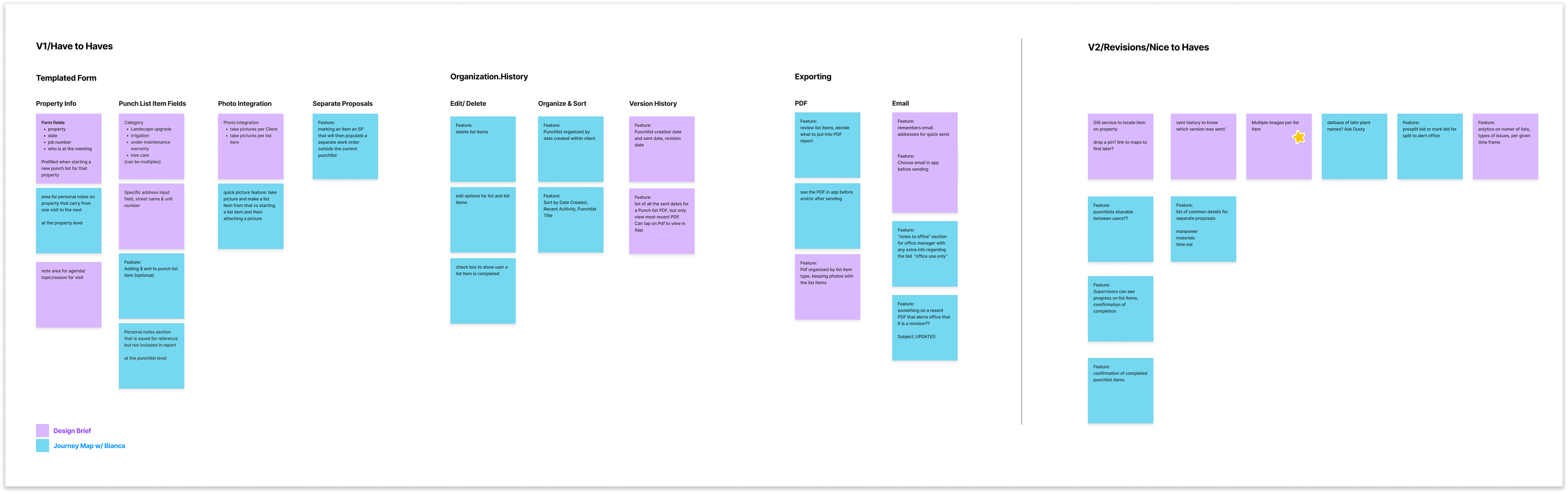
Final Feature Set
Design Exploration and Documentation
Once we had our V1 feature set established and approved, we wanted to show our stakeholders how all these seemingly separate asks fit together to actually make the app. So we built a simple feature flow to illustrate the happy path from the loading screen to sending off the punch list PDF. It showed key screens in low fidelity to keep the stakeholders focused on functionality and task completion. This simple exercise made approval fast and easy, allowing my partner and me to jump straight into wireframes.
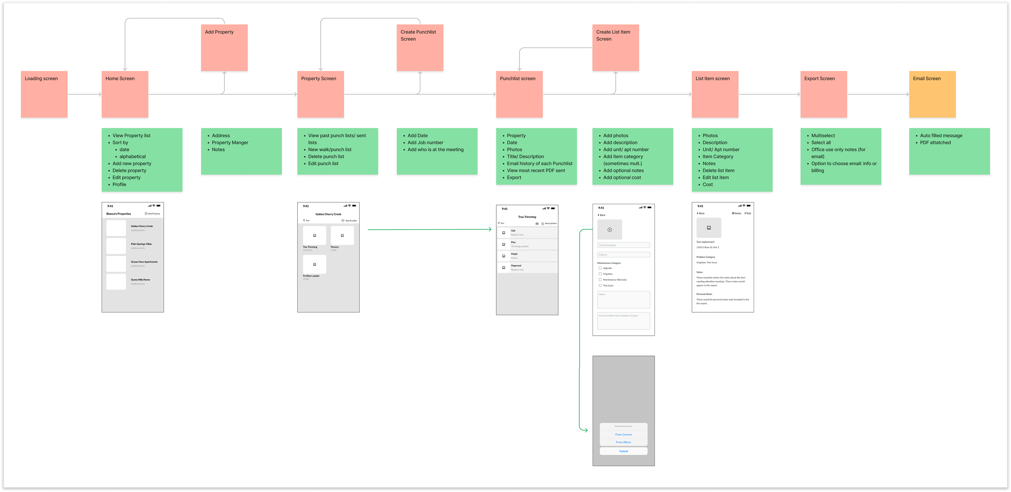
Happy Path Feature Flow
We divided the app into task sections and made wireframes of all relevant screens. This made it easy to then walk the stakeholders and development through each section, gather feedback, present updates, and get sign-off before moving on to the next section. Once all wireframes were approved, we moved on to building screens in high fidelity. Using components in the wireframes made this process quick and efficient. In most cases, it was as easy as updating components.
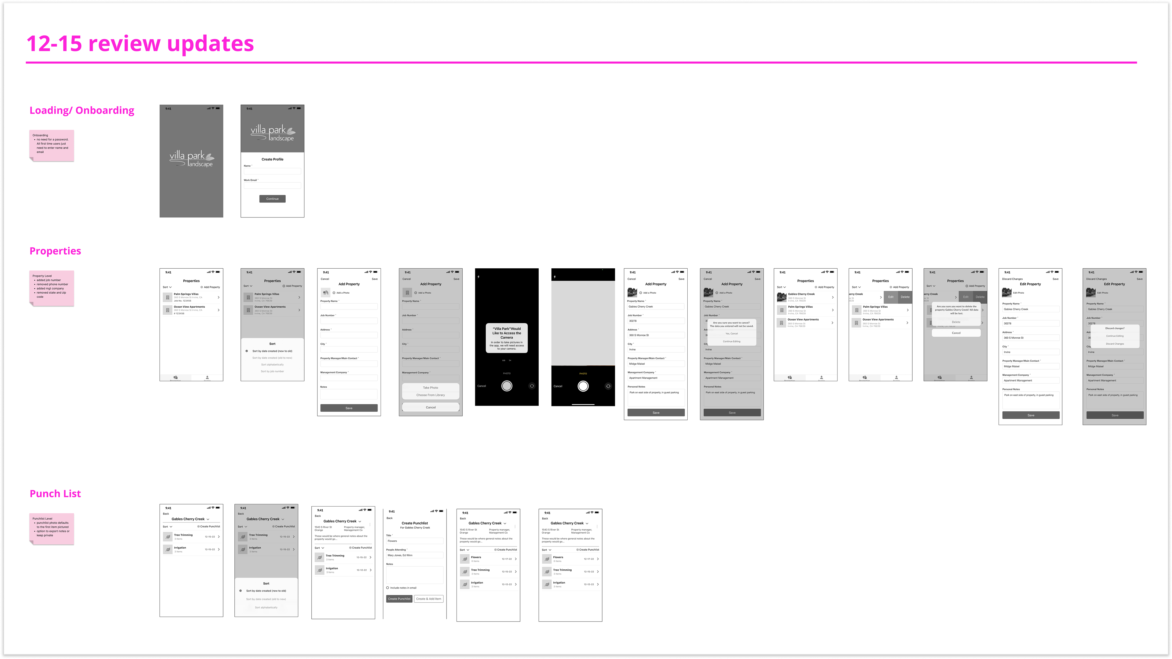
Sample of high-fidelity wireframes
In addition to the app screens, we also had to design a custom PDF template using Apple's PDFKit that could be generated by SendGrid, support photos, item descriptions, and cost estimates, and be flexible enough to be editable in Word without losing its layout. We consulted the office staff receiving and processing these files to get the content, image size, and naming conventions right. If these files didn’t work for the office staff, they wouldn’t work for Villa Park’s clients, and we wouldn’t be fulfilling the key objectives of better serving clients and increasing efficiency.
Through a cadence of reviews and iterations, we delivered over 50 unique screens, a complete user flow, a working Design System, and a custom PDF template in 4 weeks.
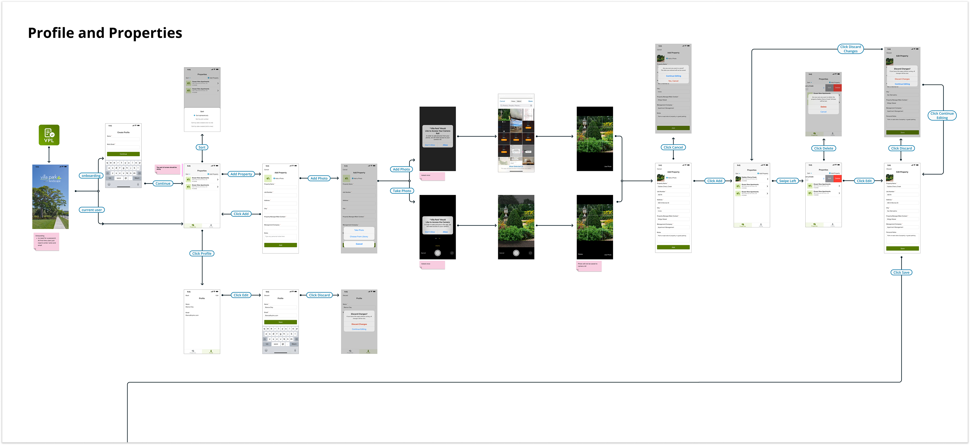
Sample of final user flow with annotations
Development and QA
Throughout the project, the design team was in constant communication with Development and QA. Our developer was our number one source of technical feasibility and it was imperative that we were all on the same page about what could be designed AND developed. Our QA engineer offered an essential viewpoint when it came to edge cases and error states. When moving at such a fast pace, she kept us honest and didn’t let anything fall through the cracks. Both teammates were essential to the project’s success.
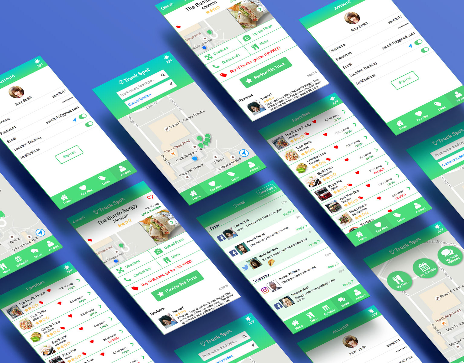
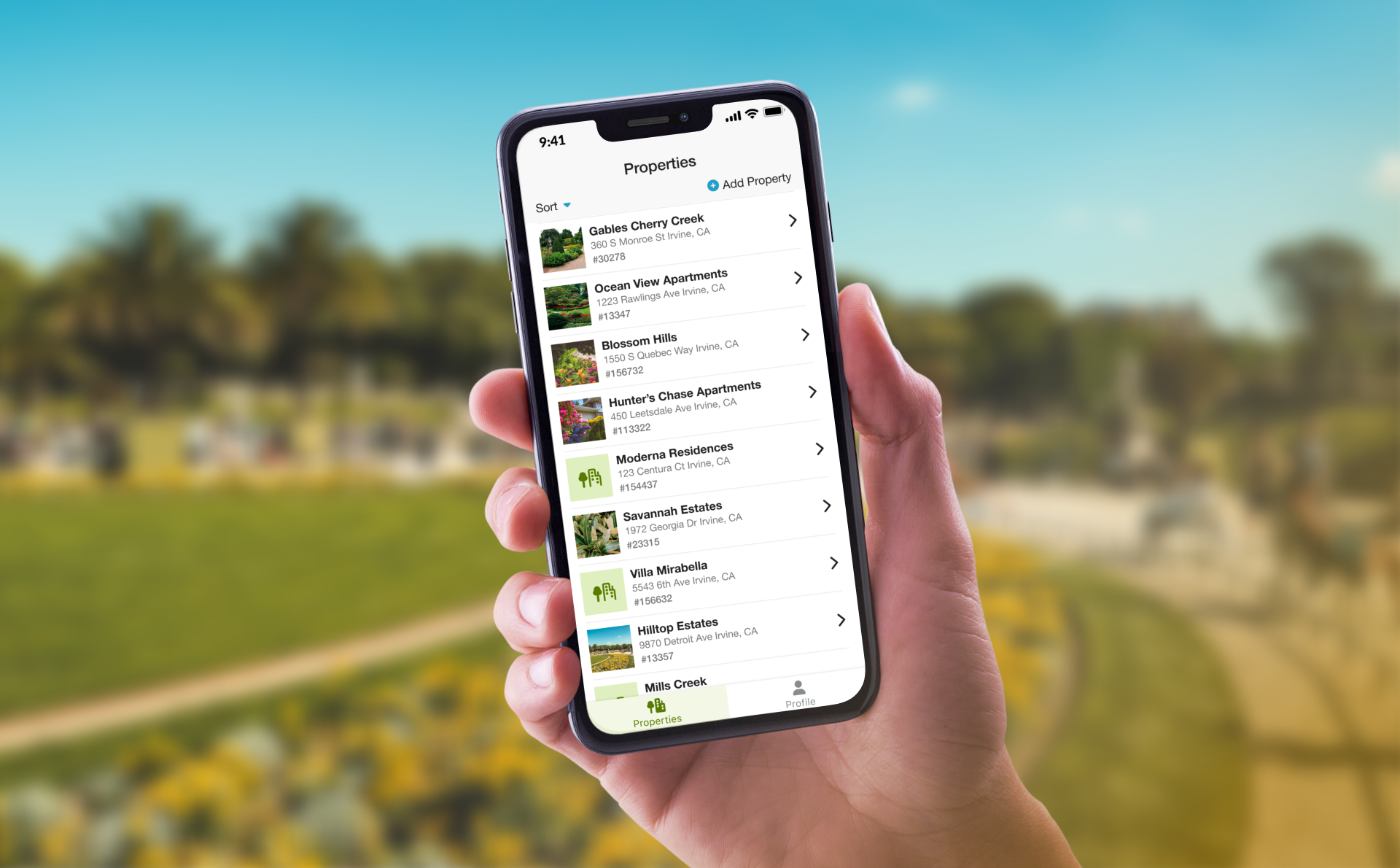
Final Design
The app was met with high praise from both stakeholders and users. Within the first 5 months, adoption was 80%, workflow efficiency increased by 150%, and their employees enjoyed the app and found it easy to use. In fact, Villa Park was so happy they returned for another design and development project to make the punch list files directly sendable to clients.
“In 2 months you designed and built us an app that is 99% perfect so overall, VERY HAPPY! And our team is very excited about how user-friendly it is. You guys did a great job!”
-Valerie, stakeholder
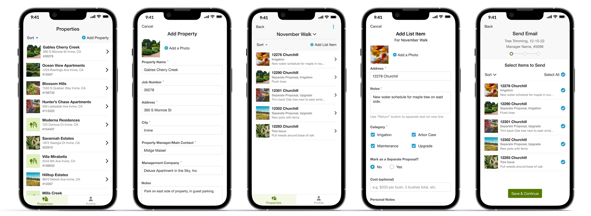
Final Screens
Learnings
• Starting from nothing has its advantages and disadvantages
• Always have a systems mindset
• Communicate early and often with your team and stakeholders
If I had more time and could do this project over again I would…
• Insist on talking to more users during the discovery phase
• Test designs with users before and after release
• Insist on more quantitative baseline metrics to measure success
• Push the UI further