UX Challenge
In an attempt to bring the Bluprint app up to parody with the desktop experience, the app team wanted to add bookmarks as a feature. In the desktop experience of Bluprint, users could mark placeholders, called bookmarks, in videos and add a note or comment. These bookmarks helped the user save important thoughts about the class they were watching in a way that could be directly linked to a moment in the video. In addition to being saved within the video, bookmarks could also be accessed in the user's library and within downloaded videos.
The Requirements
• The design should be appropriate for iOS and Android.
• The solution had to work on tablet in both landscape and portrait views.
• The user needed to be able to add a bookmark while watching a class.
• The user needed to access and edit all bookmarks in one place within the user’s library.
• The user needed to access and edit a bookmark when viewing a downloaded video within the user’s library.
Roles and Responsibilities
I functioned as the UI Designer on this project.
The Process
I received flows from my UX partner, outlining the 3 basic flows needed plus additional requirements. Native iOS action sheets were not capable of handling more than 3 lines of text input without significant development effort, so a customized text input modal was required. This custom text input field had to scroll to allow for an infinite amount of text and had to work during the initial input and editing phase of the bookmark. I also noticed the initial flows did not have any feedback for when the user saved or edited a bookmark so I added a confirmation screen to the flow.

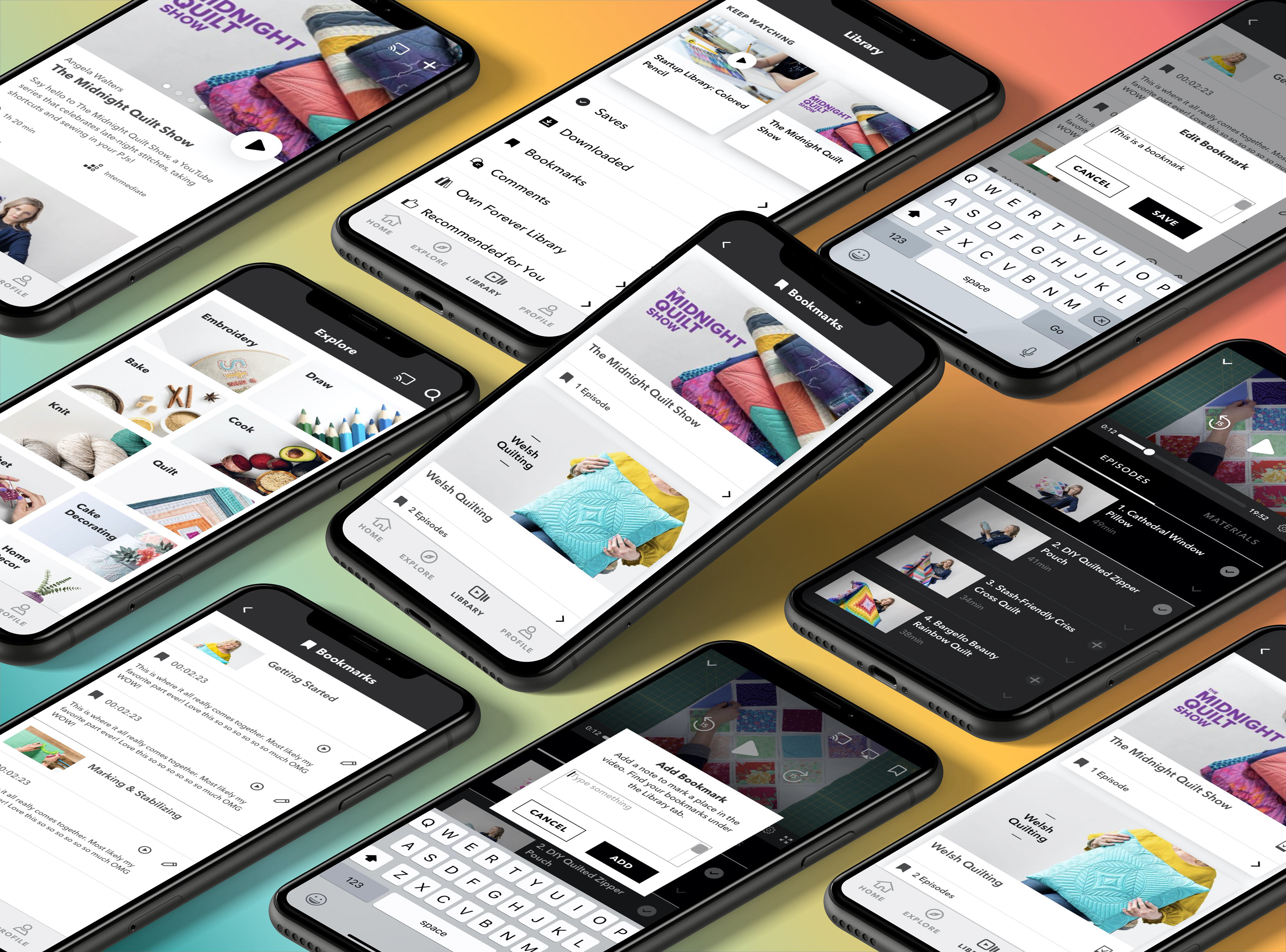
Initial flows
It also became apparent that the previous bookmark and download designs weren't structured in a way to add bookmarks for multiple videos within the same class. I devised a layout that could work for both sections, which would not only save time in development but the repeatable UI pattern would reinforce comprehension and user trust.
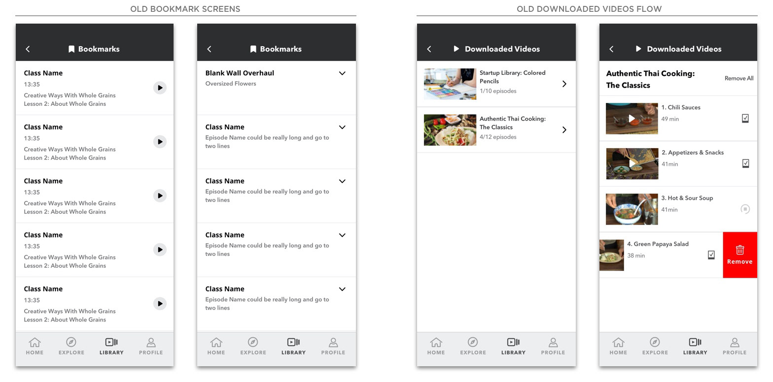
Previous designs for Bookmarks (left) and Downloads (right)
I set to work building out the mobile view, staying true to the established design patterns of the brand. I also designed elements as dynamic symbols that scaled, making the creation of the tablet views as simple as resizing the artboard.

Portrait and landscape views for tablet
I met with Product and Development and presented my high fidelity mocks for initial feedback. The designs were well received, but the mobile designs raised some complexity issues with the Android developers. Traditionally, the design team only produced iOS mocks and the Android developers were expected to interpret the designs on their end. However, they believed the UI patterns to be too iOS specific and questioned the balance of effort versus payoff, as well as platform consistency. I incorporated their feedback and designed a more Android friendly mobile version.
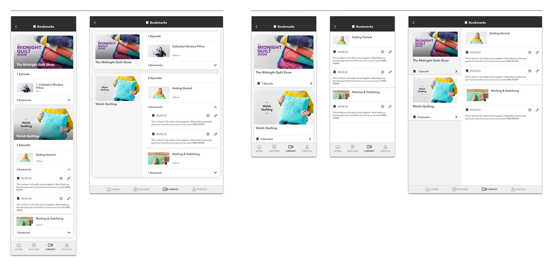
The initial Bookmarks design (left) and after feedback (right)
The final designs showcased consistent UI patterns, custom bookmark editing features, and bookmark access in multiple locations across all devices and operating systems.
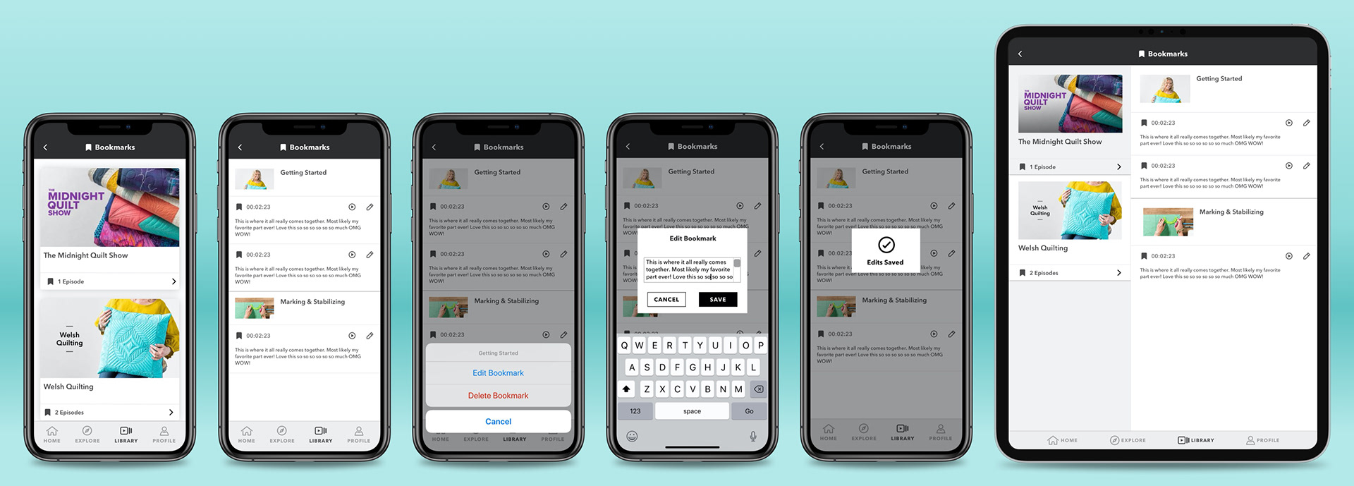
The editing flow in Bookmarks
Learnings
• Show ideas early and often to developer partners and product. Buy-in from the people who execute your designs is important if you want the final product to look like what was proposed.
• Do not be precious with your designs, they will change. Remind yourself you are in service to the team and the product. Feedback and collaboration will more almost always strengthen the final product. Plus it's important that people feel heard, no matter the outcome.
• Lean into symbols and responsive artboards. It will save you time, effort and frustration in the long run. They also make fixes and updates a breeze.