
The Problem
This project was born out of an experience I had while buying basketball tickets online. I used Flash Seats, an online marketplace that connects buyers and sellers and allows for instant sales and bidding, much like eBay. I found the whole process frustrating, tedious, and more trouble than it was worth. At the same time, I was looking for a project topic for my User Experience class. A Flash Seats app redesign seemed like a natural fit.
The main pain points I identified were:
• The system did not remember search filter options, so every time a bid was placed, the user had to go all the way back to the beginning of the process and re-select all their filter options.
• The system did not show which tickets the user already bid on or was overbid, so there was a lot of drilling down and back up to determine new bidding opportunities, which reset the search options.
• A map of the venue could only be seen at the top of the event page, and disappeared as soon as the user scrolled through the list of tickets. Unless the seat sections were memorized, it was difficult to know the quality of the tickets at first glance.
• When outbid, an email was sent to the user, but it did not include any bid details. The user had to log in to get the information.
• All bidding had to be done on a desktop, as the website was not mobile optimized and the app did not include the ability to bid.
The Goals
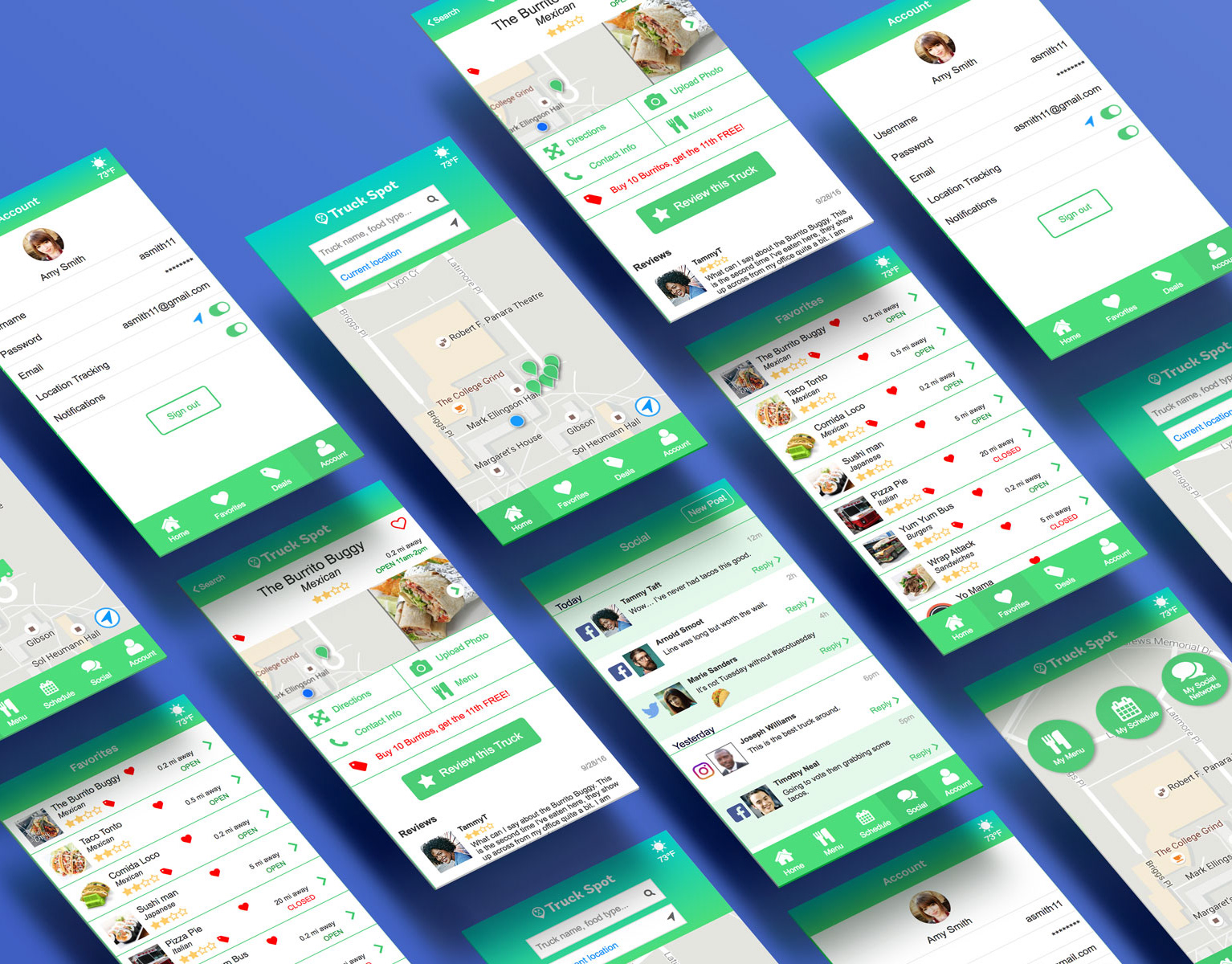
It was clear that the bidding process could be improved, so I decided to focus this project on creating a Cavs-specific mobile app that allowed the user to search, bid, and purchase basketball tickets with ease. Due to time constraints, only the buyer-facing side of the experience was explored in a closed system of Cavs home games.
My Role and Responsibilities
I worked independently on this project as both a UX and UI designer.
The Process
To begin, I crafted a UX vision statement that set the tone and the high-level goals of the project. I researched potential users and built a persona based on the research and assumptions. I performed a competitive analysis of similar ticket apps, as well as other apps the user would likely use.

Competitive Analysis
A feature and functionality list began to emerge from the data, and I bucketed the information to form high-level functional nodes. This would form the backbone of a site information architecture diagram, outlining at a high level, the flow of the app and the navigational paths between nodes.

Site Map
After getting a clear picture of the app as a whole, I did preliminary sketches of the main screens and the affordances and icons used.
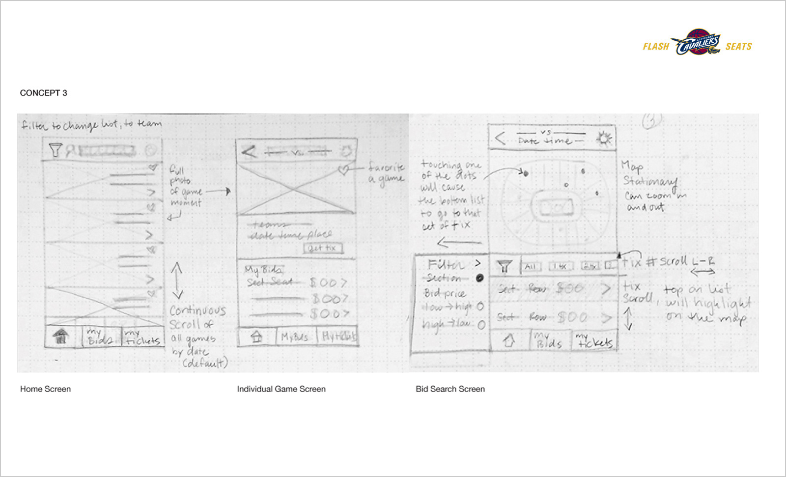
Sketches
I then built wireframes of the main screens.
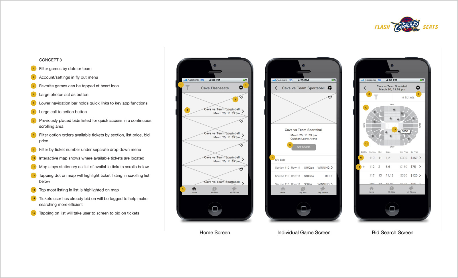
Wireframes
As the wireframes were taking shape, I began to think of a visual story that would engage the user and get them excited to bid on tickets. I put together three visual directions the app could take and chose one.
Theme Board
The Solution
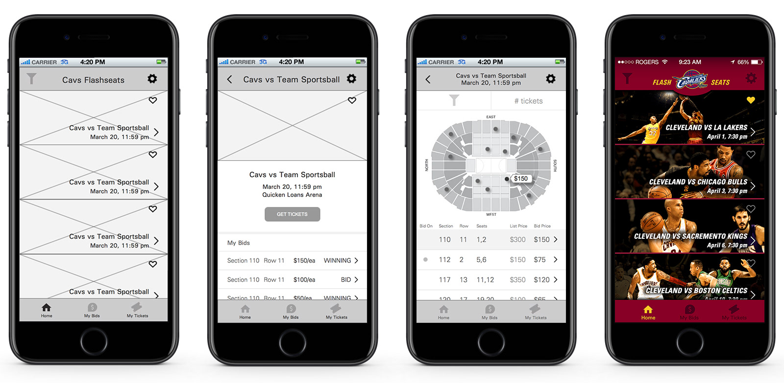
Finally, I mocked up the home screen to see the visual direction come to life.
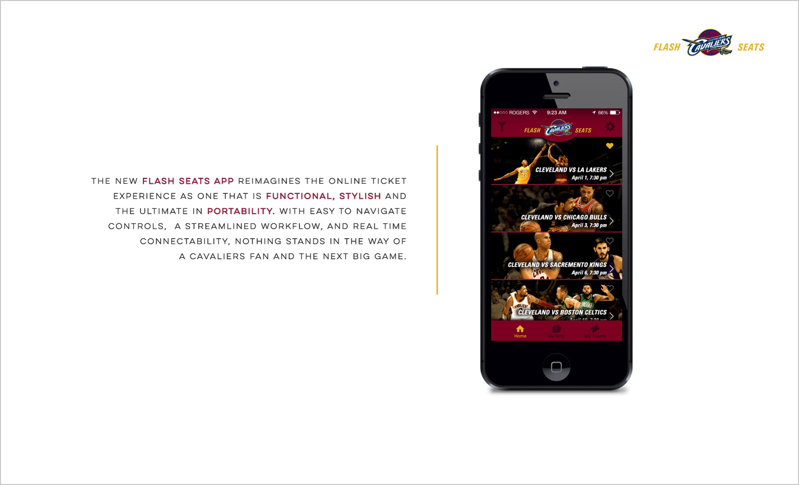
Final UI Mock
Learnings
The complexity of the site was the biggest challenge in this project. To map out the flow for every possible interaction was an exercise in organization and hierarchy that I truly enjoyed. Seeing all the dots connected gave me helpful clarity when building the wireframes. With this project, I gained a new appreciation for the skill it takes to build a successful app.
Want more? Check out the full case study.