UX Challenge
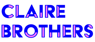
The transition from the Craftsy brand to Bluprint brought with it many new and exciting branding moments, like fresh photography styles and colors (hello, orchid!). But it also meant that the old UI no longer worked on the website or app. Because the rebrand happened very quickly, only a basic UI system was given to a 3rd party CMS developer. What launched was functional, but not a comprehensive system. There remained an opportunity to establish clear guidelines and a universal visual language in order to scale and grow the product successfully. A design system that would service both the React and CMS driven aspects of the site was the way to accomplish that.
My Role and Responsibilities
I acted as Lead UI Designer and Researcher on this project. I had support from the UX Lead and Front End Development.
What is a Design System and Why Do You Need One?
According to Design Systems by Alla Kholmatova,
"A design system is a set of connected patterns and shared practices, coherently organized to serve the purposes of a digital product. Patterns are the repeating elements that we combine to create an interface: things like user flows, interactions, buttons, text fields, icons, colors, typography, microcopy. Practices are how we choose to create, capture, share and use those patterns, particularly when working in a team."
In short, a design system structures and automates many of the most common and repeatable components of a website or app so that they can be reused in both design and development. This, in turn, produces benefits like:
• A more predictable, learnable product experience.
• A streamlined UX/UI workflow and simplified design handoff to development.
• Faster production at a higher level of quality.
• Accessibility and inclusivity built into the product from the ground up.
• Less technical debt and inconsistencies, giving rise to components that work well across form factors and code bases.
• A single source of truth and a shared vocabulary between different teams and products.
• And perhaps most importantly, the design team is free to solve bigger design problems instead of spending time redesigning established flows and design patterns.
Process
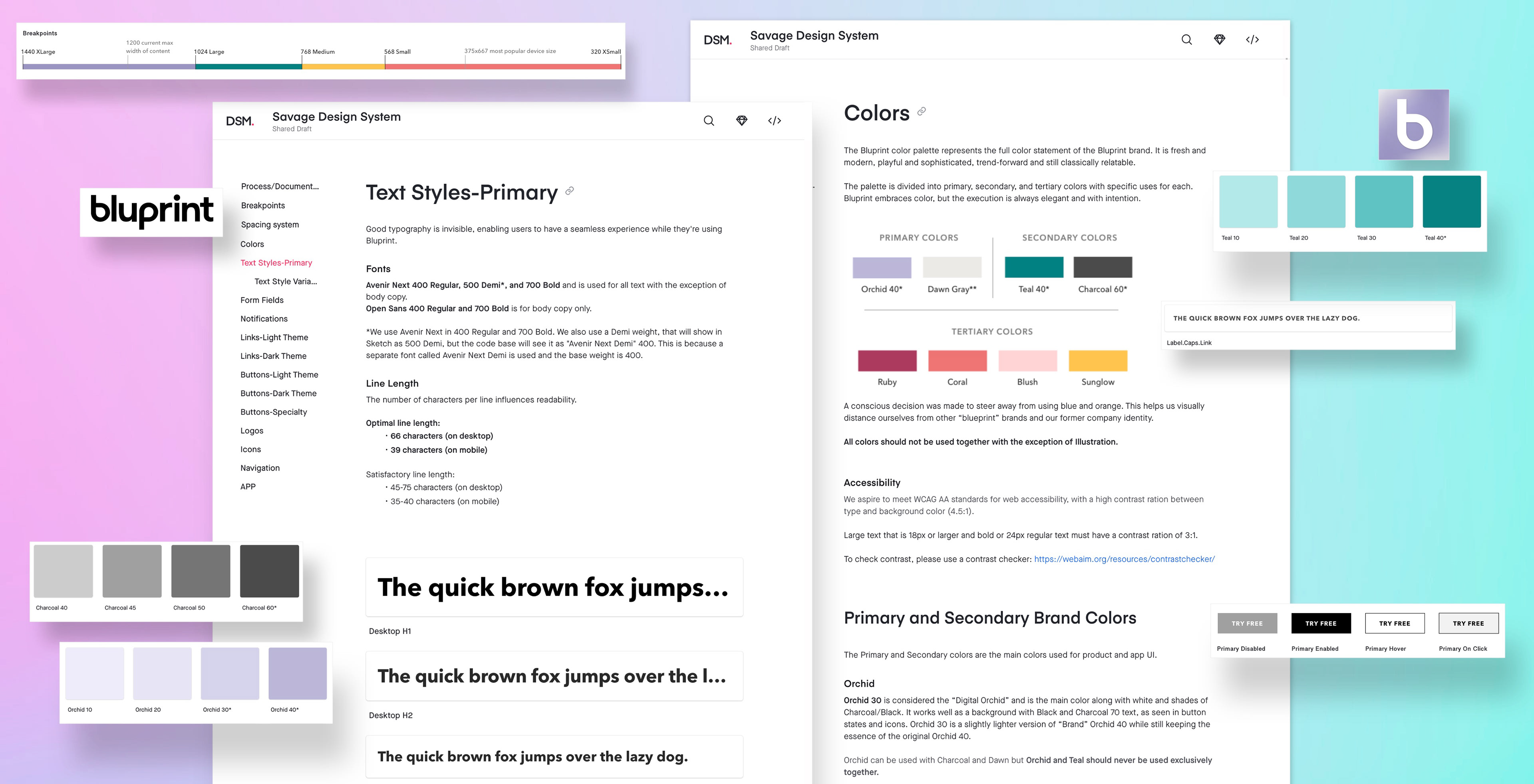
One of the key influencers to my process was Atomic Design developed by web designer Brad Frost. Its core tenet focuses on building components by establishing the smallest elements, or atoms, first. Those atoms are the building blocks with which all other components and in turn, pages, can be built. With the help of the UX Lead, we identified the most important elements for our system by consulting a UI checklist of possible atoms (font, color, etc.), molecules (form field, button, etc.), and organisms (header, footer, etc). From that list, we chose the key atoms that, when established, would drive our entire system. This became the Savage Design System MVP, in honor of a development joke surrounding our main brand color, Orchid. Ahhh, tech humor.
UI Checklist and MVP
Even with all the great reasons to build a design system, key business partners had to be on board to ensure its successful adoption by the company as a whole. So I started that process by making a presentation that outlined what a design system was, why we need one, what we hoped to build, and the steps to accomplish it.
A slide from the Bluprint Design System proposal. View full presentation here.
I presented this to company stakeholders and got the approval to continue developing the system. From there, it was a matter of tackling each atom one at a time. I followed a UX process that included research and discovery, design exploration, documentation, feedback, technical scoping, and development.
Research and Discovery
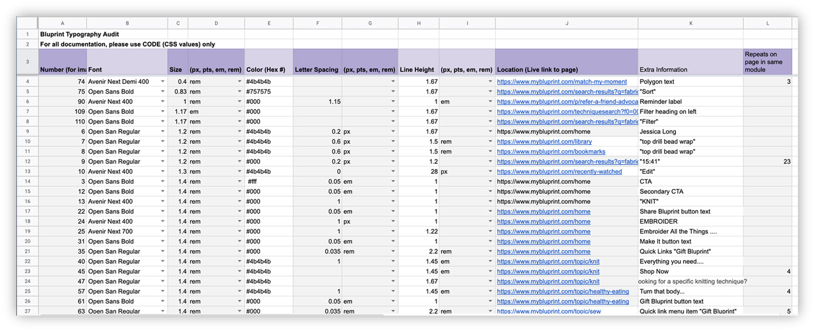
I started out by initiating an audit of the atomic element as it currently existed on our site to get a feel for how it was being utilized and where the gaps and pain points were. Some audits, like the typography scale, were more complex due to a myriad of styles floating around on both tech stacks. I asked business partners, such as Merchandising, what they felt was working in regards to the element and what they were needing to meet their goals. I also did research into current best practices, industry standards, technical limitations, and other popular design systems, like Material.io and Apple's Human Interface Guidelines.
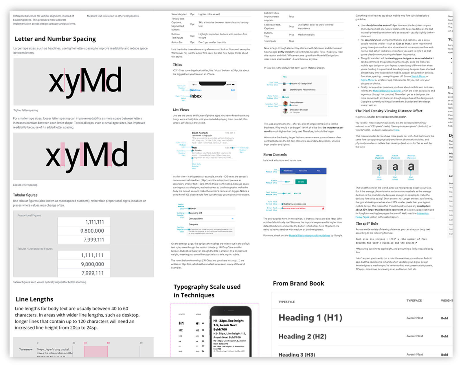
Sample from typography research Miro board
Sample from typography audit
Design Exploration and Documentation
After extensive research, I then began the design process. This involved taking the information from the audits and research and distilling down to just the parts that the new system should carry forward. And there were a lot of details to sort out. If there were headline fonts that needed to change size per device, at what breakpoints did they change and what did they change to? What color can we use for disabled type that is still accessible? Can we establish a consistent hover and on click state for CTA buttons in both light and dark themes? The list was long, but going element by element helped keep the details manageable and focused.
While designing each atom, I made sure to build everything as a symbol in Sketch. In this way, I could design various styles and mixins and swap them out within the symbol overrides, further expanding each atom's flexibility and efficiency. I also tried to take as much of the guesswork out of using each element as possible. If it was a CTA button, I built every state so there was no confusion on what it looked like or how it behaved.

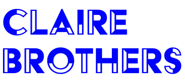
Typography Scale
In order for the design system to be successful, all elements had to live somewhere that was accessible by designers and developers alike. We chose Invision's Design System Manager (DSM) for its integration into Sketch, browser-based availability, and its updatability. It also handled documentation, which was vitally important in explaining the guidelines and guardrails for the system. I wanted any designer or developer to be able to drop into any part of it and be able to understand how each element functioned.
Feedback
Throughout the design process, I had regular check-ins with the UX team and Development to share my progress and get feedback. Being a singular designer working on the majority of the system, it usually easy to make decisions. But in order for the system to be successful, I needed people to question things and poke holes in my logic. I also looked to them when I was in a moment of indecision and the path forward wasn't super clear. My UX partners would think of things that I hadn't and that back and forth ultimately led to a stronger, more robust system.
Technical Scoping
Equally important was technical scoping with my Front End Development partner. He was as excited as I was to make this system work. We would go over the finer points of every element and he would help me understand what was possible. Everything I designed would be useless if it didn't work from a technical standpoint, and we had two tech stacks to contend with. He understood I placed a high value on making a system that was efficient and easy on developers. Because in the end, a working design system is a tool for both the designer and developer. I couldn't have asked for better project partners.
Development
Once an element was built out in Sketch and entered into the DSM, I sat down with my FE Developer partner and went over how to write up the JIRA ticket and slot it into the backlog. After the ticket was pointed and groomed and made it into a sprint, I shepherded it through development and QA, before signing off on it in UAT.
By the end of the Savage Design System MVP, Bluprint had a fully functional atomic-level design system that allowed designers to reach a new level of velocity and consistency in their work. Mockups could be created with confidence, developers had fewer questions around handoffs, and code bases were cleaner. In addition, atoms could now be combined to make organisms like form fields, notifications, and radio buttons.

Pages and elements from the Savage Design System
Learnings
• A design system is never done, it will continue to evolve and change as the user and business needs change. But if built with a thoughtful hierarchy, maintenance can be (less) painless and quick(er) to implement.
• No designer is an island, and design system creation is no exception. Its success relies on a committed team of project partners who are generous with their time and input.
• This being my first design system project, I had no real concept of the time commitment. I learned as I went, and that took some time. So much goes into each section that I couldn't have foreseen the true scope of work needed. I did my best to prioritize the most important aspects of each element, let go of perfection, and commit to iteration in order to cover all the bases.
• Organization will make or break your file structure and naming conventions. Have a point of view and commit to it, or suffer the consequences.
• No one can read your mind, unfortunately. Which is why documentation is so, so important. Assume your users are junior designers and explain in as much detail as you can stand. This will leave the system in the best place possible for the next keeper.